YouTube Trends
Code Repositories
Technique Overview
- Python
- plotly (Dash)
- pandas
- altair
- nltk
- R
- shiny
- ggplot2
- rlang
- stringr
- lubridate
- rsconnect
- Continuous Integration/Deployment
- Github Actions
- Reproducible Environments
- Testing Frameworks
- Dashboarding
- Visualization
- Wireframes
- User Experience/Interface
R Dashboard
Project Motivation
Why and how videos go viral on YouTube can seem random and unpredictable. For the growing number of content creators on the platform, understanding what makes a trending video is incredibly valuable. To support these creators, we propose to build a dashboard which highlights key information about trending YouTube videos over time. The social media video sharing platform combines multiple factors in their assessment of the top trending videos each calendar year; they are not just ranking videos based on their total number of views. By analyzing these metrics, creators can better understand trends within their category group(s) and strategically plan how to market and direct their channel accordingly to produce more trending videos.
Live Dashboard
See the dashboard live on shinyapps.io here!
Dashboard Features
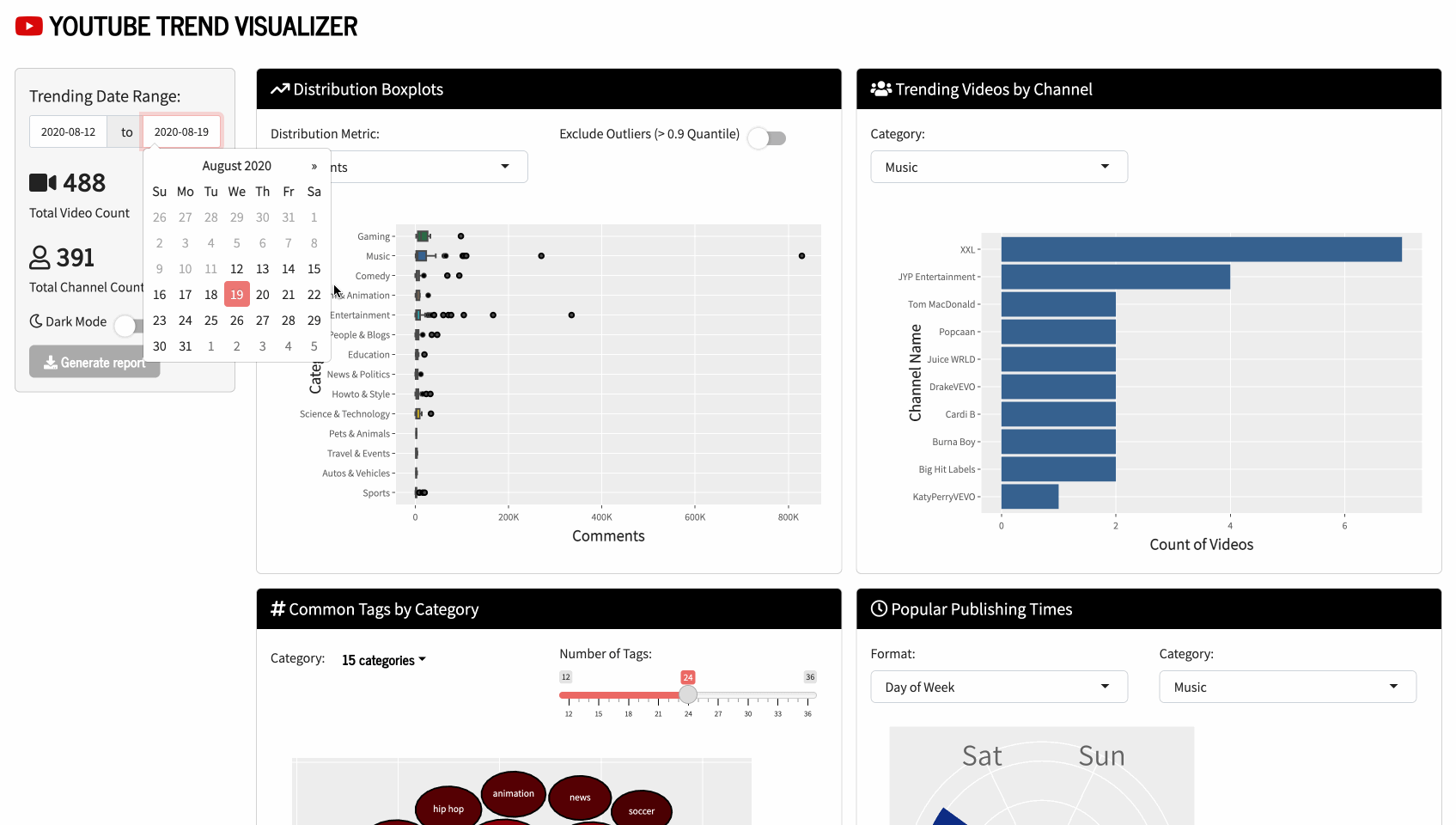
This dashboard is designed to deliver insights to YouTube content creators and enthusiasts on the top daily trending videos hosted by the platform. The visualization tool captures user interactions (likes, views, comments), publishing and trending dates, tag lists and more across tens of thousands of videos, with aims to have users interpolate their own understandings of YouTube’s data using an effortless and engaging online interface.
The landing page gives users the ability to customize their viewing experience by adjusting the timeframe of interest using calendar widgets. This will adjust all charts on the web app to only illustrate data from videos that were trending between the chosen date settings. The four key visualizations are as follows:
Category Boxplots
Users can select via dropdown menu whether to plot the distribution of likes, comment or views across video categories. This provides an overview of different measures of popularity (including the median and interquartile range) for each group.
Top Channels Bar Chart
Creators may wish to see who the trendsetters were during a time period. A bar chart can capture the number of trending videos published by each top creator (by category, selected via menu), thus allowing users to determine where they stand in the lineup and/or find new sources of inspiration for their channel.
Popular Tags Bubble Chart
Dashboard visitors can observe common words and phrases in tag lists from numerous trending videos. A checklist menu will permit viewers to view tags from multiple categories so that they may integrate terms that are popular across communities to improve overall reach. To enhance data visibility, users can mouse over the bubbles to view a tooltip displaying the frequency of each tag by category.
Publishing Date Circular Bar Chart
A dropdown menu will provide options to customize the display to organize results by time of day, day of the week, or month of the year to highlight popular upload days/times on YouTube. This will enable users to make informed decisions about when to post to best increase their chances of having a viral video.
Dashboard Sketch
Please click on the link below to access the sketch on Figma. More detailed mockups of the intended features are included in the image below.
Python Dashboard
Dashboard Features
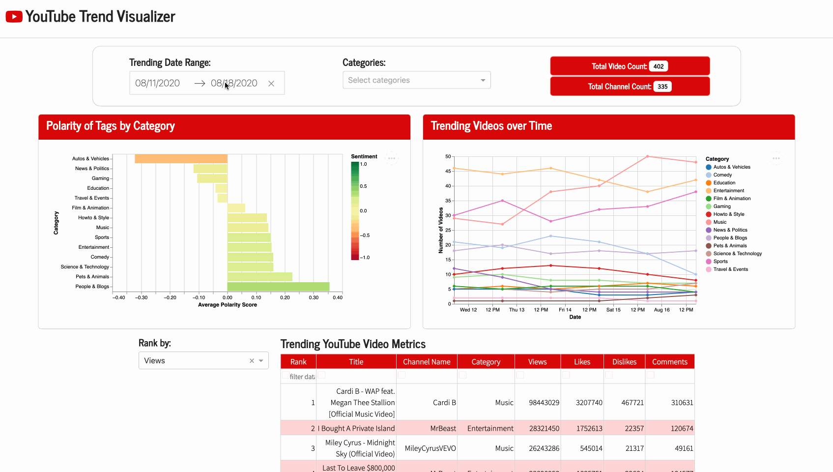
This dashboard contains a single landing page that allows users to easily visualize YouTube video metrics. There is a calendar widget that can be configured to focus on trending videos between a date range. If desired, users can apply an additional filter using the dropdown category menu, which can be parsed by selecting and/or searching for topics of interest. These filters will update the settings for each plot and table, allowing for improved visibility and interpretation of trends over time. Aggregate counts of the number of videos and channels are also displayed to provide a comprehensive overview on the amount of data points displayed.
😀 Polarity Score Chart 😩
The polarity score of a video’s taglist can be computed using the Natural Language Toolkit sentiment analysis library. This package contains a pre-trained model called VADER (Valence Aware Dictionary for Sentiment Reasoning) which can be leveraged to assign proportional polarity scores for positive, neutral and negative sentiment in text, as well as a compound score that is normalized between -1 and 1.
The bar plot displays this compound score as an average for each category of videos. Hovering over each bar shows the number of videos that comprise each category. Categories with tag lists that are considered more “positive” are closer to green, whereas categories with “negative” sentiment will appear more red (neutral is yellow).
📈 Category Trend Chart 📉
Users may be interested in seeing how many videos were trending over time in each category. A dotted line chart displays these fluctuations by date within a specified ranged (with the ability to mouse over points for summaries) to better examine trends in cases where lines may be overlapping or unclear.
👍 Video Metrics Table 👎
To parse details on the data included in the above charts, users may reference the metrics table for the title, channel name and category for each trending video. It features sorting and filtering options to allow you to search for specific channels, titles and categories or individual words like ‘BTS’ or ‘VEVO’. The ranking widget assigns a rank according to the number of likes, dislikes, comments or views that a video received relative to others in the filtered data, thus allowing users to see these positions while ordering by another metric if desired (ex. rank by view, order by dislikes).
Live Dashboard
The dashboard is deployed on Render. You can view and interact with the app by clicking here.
References
Youtube. (2023). YouTube Trending Video Dataset (updated daily) [Data set]. Kaggle. https://doi.org/10.34740/KAGGLE/DSV/5003820
Note: As I’m based in Canada, I am using data extracted from videos that were trending in Canada due to file size limitations and for ease of loading/extraction. However, given the flexibility of this web app, it can be easily extended to YouTube data from other countries.